This was a great semester. I think everyone of us had some difficulties during this semester. Personally, I learned so many things in terms of design and the principles of design. I want to send special thanks to the ones who continued the semester with me (Nigel, Anya, Jose, Brooke, Emiko, Nicolas, Sara, Heather, Angelica, Veronica, Susana, Scott, Randy and Michell) and of course, Angela. I also thank the ones who left before it was over.
Some words I will not forget like, "Kerning", "Spacing", "ledding", and "hierarchy". I will not forget some other phrases such as "problematic" and "How is everybody going?" lol.. it was just a reminder.
Take care, classmates
Wish you a great summer,
Monday, June 13, 2011
PDF Files!
OK.. very nice. This blog is not posting the pdf files. I donno why. It keeps rejecting the pictures of my work. If any one has an idea, please do me a favor.
Sunday, May 22, 2011
living Among Type #?

Lower case r. I had a hard time finding this letter.

lower case x.

Capital L.

H

I know this photo shows several letters, but I choose the capital N in the middle.
Tuesday, May 17, 2011
Monday, May 9, 2011


Sunday, May 8, 2011
Monday, May 2, 2011
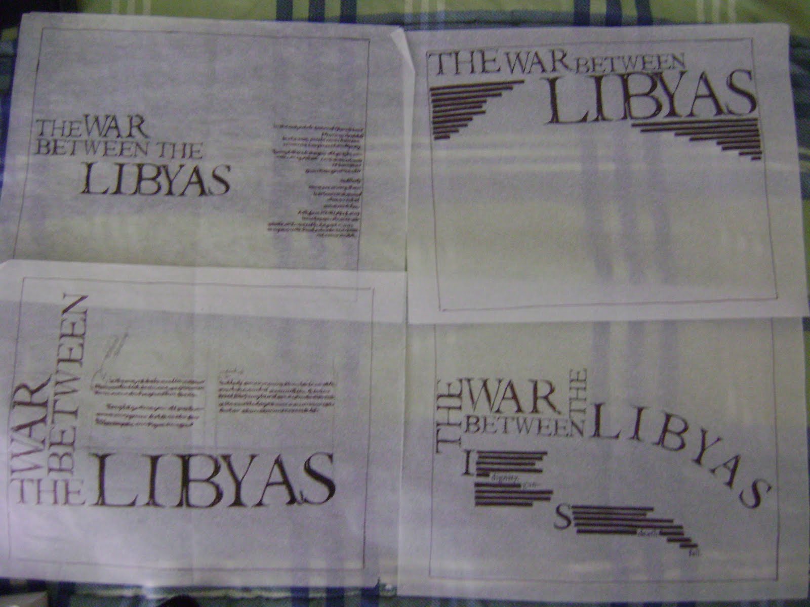
Paragraph of Assignment 2 (Part 3)
War! The word war holds many meanings in itself. War usually occurs between two nations, races or political parties, etc. In other words, it is a conflict between two parties. A reason for war is hate. People sometimes hate because they are afraid. The fear of change caused by the other party or the other nation. That is a possible reason why people promote wars. The war between the Libyans has the same reason. The regime on the west side is afraid of civilians on the east side of the country.
Sunday, April 24, 2011
living Among Type #9

I think this was in the California Science Center. On here you can see the capital F formed by the column and the second and the third floor.

This is one of the beams. It shapes the capital M.

Natural light is very important in a building. If we look at shadow, we can see the different shapes. In this photo, I recognized the S shape on the middle column.

I took this photo of the shell. It presents the lower case C.
living Among Type #8

My shades form capital X

I love this one. In here I visualized two triangles in an orange section. For me, these two triangles form the capital B. It is abnormal and unique and that is why I like it.

At the theater, I found this capital B.

I am fascinated by architecture. I am also amused by the vertical and horizontal lines that architecture makes. In here I am showing the capital W.

Tuesday, April 5, 2011
Sunday, April 3, 2011
Assignment#2 part 2 communicating sentence
In this Assignment, I chose Century Schoolbook typeface. I find this typeface very simple to deliver the idea of a conflict between two parties. This typeface is used in history books, so I find it legitimate to use it because this period of time will be a huge change in our world's history. My message is simplicity. I try to express the idea of war (conflict) between the two parts of Libya (the east and the west) in a very simple and direct way. In my work, I tended to present some roughs as titles of reports in a newspaper. In some other roughs, I tried to visualize the conflict by creating some shapes out of the letters which could express the meaning of the war.


living Among Type #6

This is a hanger which I use here as a lowercase J

My T-square presents T

Capital Z

The lowercase U
Saturday, March 26, 2011


Sunday, March 20, 2011
living Among Type #5

This is the lower case J.

This photo shows the lower case B.

Well, this photo was taken from a news paper. This page was up-side-down, and it hit me right away that it was a lower case B .

Tuesday, March 15, 2011
The Golden Ratio.. 1.618
This is interesting. It could be old information, but it worth a research. Comments please! :)
The Difinition of the Word War
According to Dictionary Reference the word "war" has several meanings:
1. "a conflict carried on by force of arms, as between nations or between parties within a nation; warfare, as by land, sea, or air."
2. "active hostility or contention; conflict; contest."
3. "a struggle."
In Merriam Webster the word war defined as a warfare or "an activity undertaken by a political unit (as a nation) to weaken or destroy another."
Sunday, March 13, 2011
living Among Type #4

This photo has more than one letter actually. I can see the main one which is the P. and on the left top of it you can notice the A.

In the fish photo I found the lower case G. It is in the dark-blue on the fish.

I took this photo for the oval O.

Here I can see the capital D. I do not think it is a good picture, so please give me your advice guys.
Tuesday, March 8, 2011
Assignment#1 ( Type is showing its elements of design)
These photos are the second drafts. After the first roughs, I could distinguish between each principle of design and another. The ability of telling the differences between each principle and another increased my understanding to the concept of type as an object.
 The two squares on the left hand side present sizes and the next two present shape.

In the second photo, the lines are shown on the left, and the directions on the right side.

The last photo shows the color on the left and the texture on the right. Please a small comment from you can help me improve my work.


In the second photo, the lines are shown on the left, and the directions on the right side.

The last photo shows the color on the left and the texture on the right. Please a small comment from you can help me improve my work.
Subscribe to:
Posts (Atom)